Our recent short The Interview was an unusual project, in that it was originally created for an 85-second competition, over the course of a long weekend. Subsequently we went back and re-edited the film into a longer format, resulting in two very different versions of the same film. We’ve covered pre-production and production on the blog already and now it’s time to take a look at post-production in a bit more detail.
The edits
First up, we have the two edits of the film. Let’s take a look at them in case you haven’t watched them yet.
Here’s the original 85-second cut:
And here’s the 140-second cut:
Other than the evident difference in length, there are some key changes in the extended cut. Rather than expanding upon the original edit, I went back to the drawing board and edited on a clean timeline, building it up from scratch. A few things to note about the extended cut:
- No side angles or dolly shots are used. It remains exclusively with the straight-on shots, cutting from the wide to the close-up (with a couple of extra close-up inserts of key details). Holding on the straight-on shots maintains a tension throughout; an uncomfortable focus on the lead character, making him the centre of attention, just like the feeling of being in an interview. Cutting to side shots added nothing to the story.
- Awkward pauses between lines have been stretched out artificially in a few places by using additional footage on the end of takes. One fun example of this is right at the start, in the mid shot, just after Tom adjusts his tie: that wasn’t even a proper take. It was just a camera test which was recorded, with Tom waiting for the director to call action. Looking through the footage, it jumped out as a nice blank opening shot.
- The IAT ident is reinstated at the start. Didn’t seem right without it. Note how the cuttlefish enters shot from the top of a 16:9 frame, but the steamwhale enters a wider aspect ratio which is then used for the rest of the film. A minor detail but I thought it was quite fun to have the cuttlefish bust out of the boundaries of the letterboxed frame.
VFX
The original cut had a single VFX shot, right at the end, with subtle ‘devil horns’ visible on Tom’s shadow as he says the line “see you in hell!” This shot was removed from the extended cut and replaced with some more elaborate ideas.
The location featured two conveniently placed doors, leading through to a couple of generic offices. In the 85-second cut these offices are dark and nondescript. Here’s a frame from the original footage:
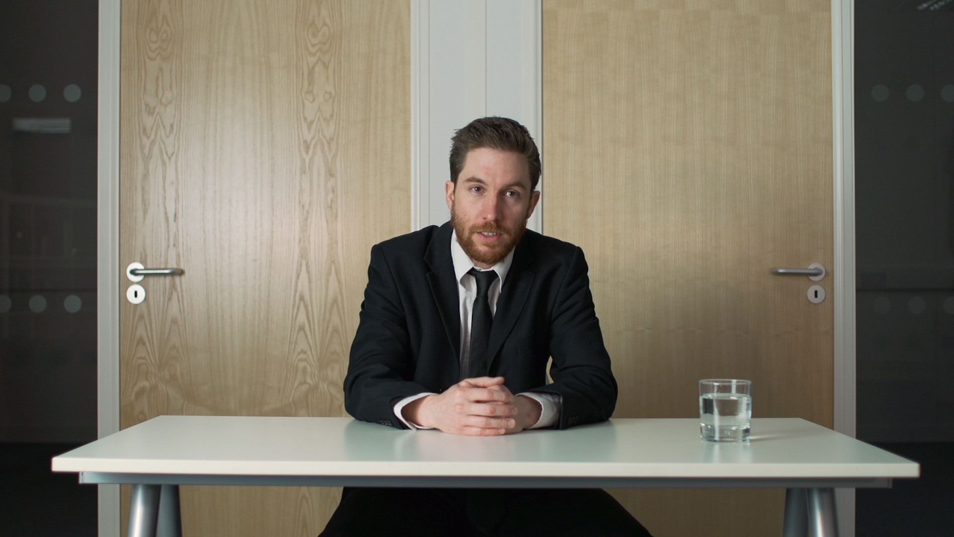
And here’s the same shot in the extended cut:
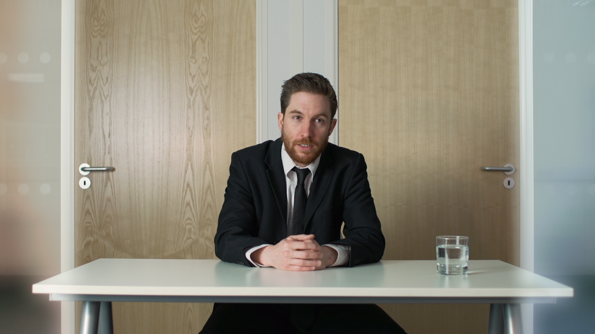
The ‘Heaven’ door was given a soft blue glow and the ‘Hell’ door a soft red glow. It’s hopefully subtle enough that to new viewers it’s not immediately evident, but it does serve to highlight that there’s a choice at work in the story.
The main VFX shot arrives at the end with the ‘demon face’ glitches. I wanted this to be a relatively naturalistic demon, rather than the over-the-top horror movie style face distortion often seen online. The film was never shot with this in mind but the key shot at the end of the film is locked off and features limited movement from Tom, making it possible to track on some digital prosthetics.
My original plan was to have the demon face flash up for just a couple of frames, so I took this frame:
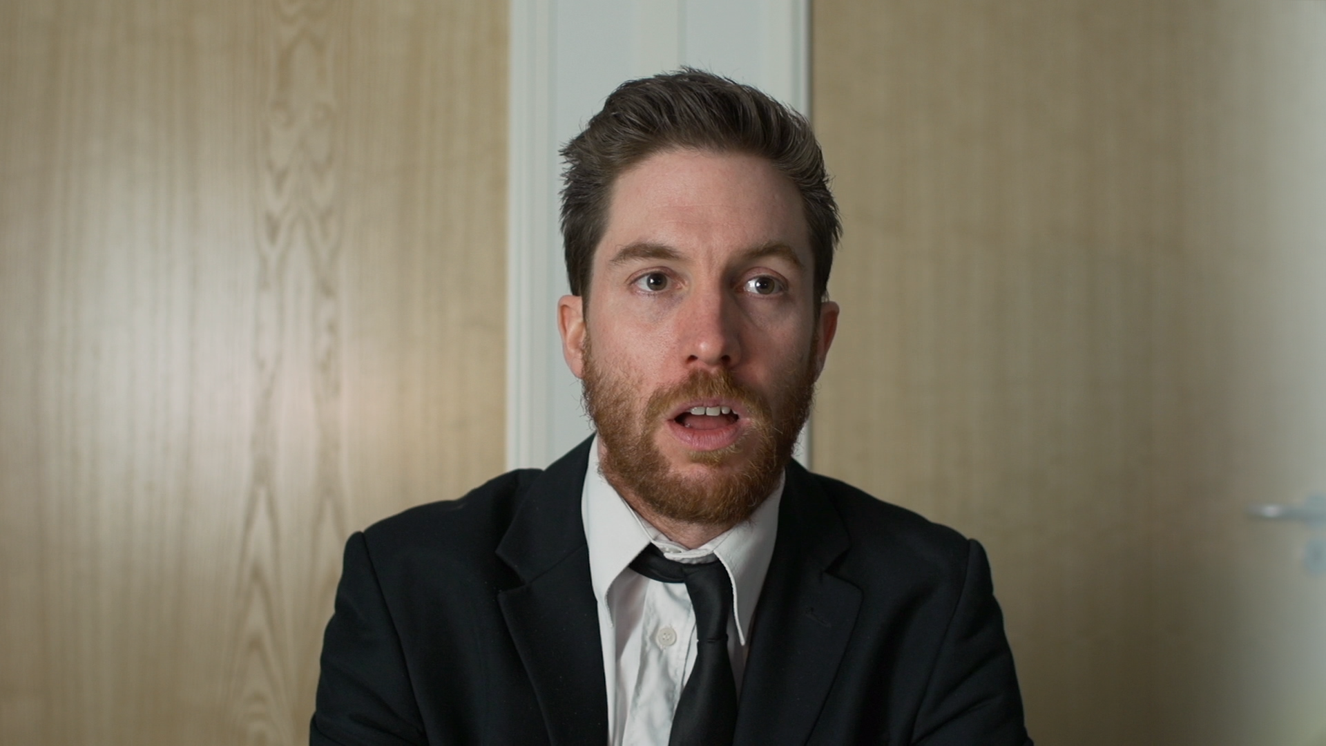
And then brought it into GIMP and hand-painted some demon prosthetics. This I then exported out as its own layer for compositing inside HitFilm 2 Ultimate:
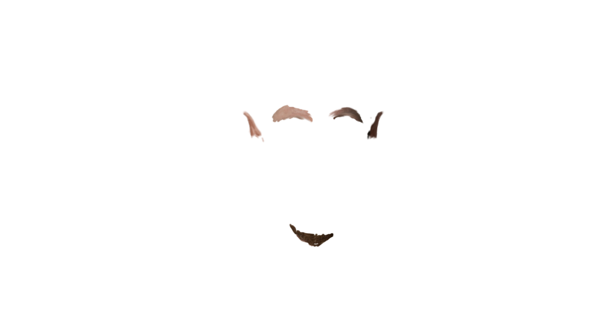
You can see in the image above that the original plan was to augment Tom’s beard into something a bit more pointy and devilish, but I decided against that for the final shot, focusing instead on the eyebrow removal and ears.
Next up was tracking the movement of Tom’s face. For this I used HitFilm’s built-in 2D tracker, which worked just fine. A more complicated head move would require a more sophisticated track, perhaps shifting over to using mocha’s tracking abilities as used on the TV show GRIMM. Anyway, here’s all the tracked data I ended up with:
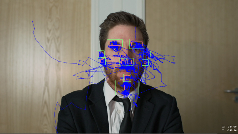
I then duplicated the prosthetic layer into multiple pieces for each ear and the eyebrows and tracked them onto the relevant sections. It only required a little bit of fine tuning to get the effect working. You can see a raw version of the effect in action over the duration of the entire shot here:
http://www.youtube.com/watch?v=YxHujJAE0rE
There are, of course, errors in the shot, primarily with the eyebrows drifting a couple of times, and of course all the prosthetics go flying off in a comedy fashion at the end. In this particular case it didn’t matter, however, as I already knew that I was going to use the shot sparingly, appearing very briefly in a jittery, glitchy manner.
The glitching appearances were really easy to handle. I’d edited the film in Premiere Pro CC and was using HitFilm Plugins to grade the film. Each glitch segment required the application of three effects from the plugins pack:
- Jitter automatically causes stuttering and out-of-frame-order playback. You could do that manually, of course, but slapping on a plugin makes it a lot easier.
- Film damage adds all the dirt and gunge to the frame, plus random defocusing and frame jumps. I went for quite an extreme usage – more than you’d use if you were using it for a whole shot.
- Shake adds artificial movement, giving the shot a floaty feel as if shot handheld. Notably, I applied shake after the jitter effect, so that the floaty virtual camerawork plays out in order even as the underlying frames are played out-of-order.
Finally, the extended version has a completely new grade. The original grade was done in a hurry and suffers from ridiculous over-sharpening – entirely my fault – which didn’t do Josh’s camerawork justice by any means. The extended cut gave me an opportunity to go back in and regrade, with more successful results.
That was about it for The Interview. The final step was to have the credits play in reverse direction, descending down into the depths and turning slightly red as they went.
We hope you enjoyed this glimpse behind-the-scenes!
